Unlock hundreds more features
Save your Quiz to the Dashboard
View and Export Results
Use AI to Create Quizzes and Analyse Results

Sign inSign in with Facebook
Sign inSign in with Google
Quizzes > High School Quizzes > Arts & Humanities

Color Theory Quiz Practice Test

Explore art fundamentals with interactive practice questions
Difficulty: Moderate
Grade: Grade 8
Study OutcomesCheat Sheet
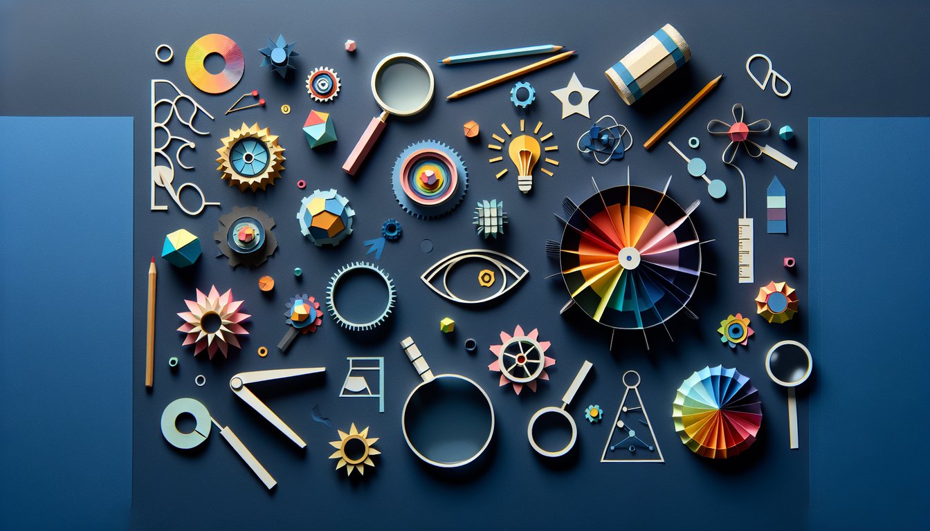
Colorful paper art promoting the interactive Color Spectrum Challenge quiz for students.

Which set of colors are considered the primary colors in additive color mixing (light)?
Red, Blue, Yellow
Cyan, Magenta, Yellow
Red, Green, Blue
Green, Orange, Purple
Additive color mixing involves combining red, green, and blue light to create a range of colors. This principle is used in digital displays and other light-based technologies.
What is the primary effect of a prism on white light?
It absorbs all wavelengths of light
It amplifies the intensity of white light
It scatters light randomly without color separation
It splits white light into its component colors
A prism refracts light, causing different wavelengths to bend at different angles. This separation results in the visible spectrum of colors emerging from white light.
Which of these best describes complementary colors?
Colors that have similar brightness
Colors next to each other on the color wheel
Colors that are opposite each other on the color wheel
Colors that are created by mixing primary colors
Complementary colors are found directly opposite each other on the color wheel. When paired, they can create strong visual contrasts and tend to neutralize each other when combined.
What are the secondary colors formed from traditional pigment mixing?
Black, White, and Gray
Red, Green, and Blue
Green, Orange, and Purple
Cyan, Magenta, and Yellow
When the primary pigments (red, blue, and yellow) are mixed, they create the secondary colors: green, orange, and purple. This concept is a cornerstone of traditional color theory in art and design.
What term refers to a color in its pure state without any tint, shade, or tone modifications?
Hue
Shade
Tint
Tone
A hue is the pure base color without any addition of white, black, or gray. Tints, shades, and tones refer to modifications of a hue achieved by adding white, black, or gray, respectively.
Which set of colors are considered the primary colors in subtractive color mixing (traditional pigments)?
Red, Green, and Blue
Red, Blue, and Yellow
Orange, Purple, and Green
Cyan, Magenta, and Yellow
In traditional pigment mixing, the primary colors are red, blue, and yellow. These colors combine in various ways to produce secondary colors and are fundamental to subtractive color theory.
How does the additive color model differ from the subtractive color model?
Additive mixing subtracts wavelengths, while subtractive mixing adds wavelengths
Additive mixing creates darker colors, while subtractive mixing creates brighter colors
Additive mixing uses light, while subtractive mixing uses pigments
They are identical processes with different applications
The additive model involves combining colored light (typically red, green, and blue) to create various colors, while the subtractive model involves mixing pigments that absorb light. This key difference underpins technologies like digital displays versus printed materials.
Which property of light determines the color we perceive?
Intensity
Polarization
Speed
Wavelength
The wavelength of light is the primary factor in determining the color that we perceive. Different wavelengths correspond directly to different colors in the visible spectrum.
What causes the dispersion of white light when it passes through a prism?
The prism accelerates some wavelengths
Different wavelengths refract by different amounts
The prism filters out specific colors
Random scattering of light inside the prism
Dispersion occurs because each wavelength of light bends, or refracts, by a different amount when passing through a prism. This separation of wavelengths produces the spectrum of colors visible in white light.
Which group of colors is generally considered as warm colors?
Red and Orange
Black and White
Blue and Green
Violet and Indigo
Warm colors, such as red and orange, are often associated with energy, warmth, and excitement. These hues tend to dominate scenes that aim to evoke feelings of heat or vibrancy.
When mixing blue and yellow pigments, what color is typically produced?
Brown
Purple
Orange
Green
Mixing blue and yellow pigments results in green due to the subtractive nature of pigment mixing. This is a basic principle in color theory used widely in art and design.
Which physical process is responsible for the formation of a rainbow following rain?
Reflection of sunlight off the ground
Polarization of sunlight by water molecules
Refraction and dispersion of sunlight by water droplets
Diffraction of sunlight around raindrops
Rainbows form when sunlight is refracted and dispersed through water droplets in the atmosphere. This process separates the light into a spectrum of colors, creating the arc of a rainbow.
What is defined as a tint in color terms?
A color mixed with white
A color mixed with gray
A color with high saturation
A color mixed with black
A tint is created when white is added to a pure hue, lightening the color. This concept is key in understanding how colors can be modified to achieve different effects in design.
Which of the following best characterizes an analogous color scheme?
Colors that create a high contrast
Colors that are a mix of complementary pairs
Colors adjacent to each other on the color wheel
Colors located opposite each other on the color wheel
An analogous color scheme uses colors that are next to each other on the color wheel, resulting in a harmonious and cohesive look. This scheme is often employed to create comfortable and visually appealing designs.
What does the term 'saturation' refer to in color theory?
The intensity or purity of a color
The lightness or darkness of a color
The blend of multiple colors
The temperature of a color
Saturation describes how pure or intense a color is. A highly saturated color appears very vivid, whereas a less saturated color may seem washed out or muted.
How is a secondary rainbow formed in nature?
By two internal reflections within water droplets
By scattering of light due to dust particles
By the refraction of light only
By a single reflection inside the rain droplet
A secondary rainbow is created when light undergoes two internal reflections within raindrops. This extra reflection inverts the order of colors and produces a fainter arc compared to the primary rainbow.
What optical phenomenon is primarily responsible for chromatic aberration in lenses?
Polarization of light within the lens
Light interference from multiple surfaces
Diffraction at the lens edge
Differential refraction of varying wavelengths
Chromatic aberration occurs because lenses refract different wavelengths of light by varying amounts. This causes different colors to focus at different points, leading to a blurred or colored fringe around images.
Why does mixing several subtractive pigments often yield a muddy or brown color?
Because pigments cancel each other's colors out completely
Because the pigments form a reflective layer on top
Because overlapping absorption spectra reduce overall color purity
Because the mixing process enhances brightness
When multiple pigments are mixed, each one absorbs certain wavelengths of light. The overlapping absorption leads to a reduction in color purity, resulting in a muted, muddy hue rather than a vibrant color.
What effect is observed when a light beam passes through a medium with varying refractive indices?
The light is absorbed completely
The light forms a coherent, singular color
The light remains a uniform beam
The light disperses into a spectrum of colors due to differential refraction
When light travels through a medium with changing refractive properties, each wavelength bends differently. This differential refraction causes the light to spread out into its constituent colors.
How does metamerism challenge our understanding of color perception?
It confirms that color is an absolute property of objects
Color perception is solely determined by the intensity of light
Different spectral compositions can appear identical to the human eye
All colors must have a unique spectral composition
Metamerism occurs when colors with differing spectral makeups appear the same under certain lighting conditions. This phenomenon emphasizes that color perception is dependent on the observer and environmental factors, rather than being solely determined by physical properties.
0
{"name":"Which set of colors are considered the primary colors in additive color mixing (light)?", "url":"https://www.quiz-maker.com/QPREVIEW","txt":"Which set of colors are considered the primary colors in additive color mixing (light)?, What is the primary effect of a prism on white light?, Which of these best describes complementary colors?","img":"https://www.quiz-maker.com/3012/images/ogquiz.png"}

Study Outcomes

  1. Identify primary, secondary, and tertiary colors in the visible spectrum.
  2. Explain the role of light wavelengths in determining perceived color.
  3. Analyze how different color mixing techniques create complementary and analogous schemes.
  4. Apply optical science concepts to solve color theory problems.
  5. Evaluate the impact of color filters on light and color perception.

Color Theory Quiz - Practice Test Cheat Sheet

  1. Color Wheel Basics - The color wheel is your most playful friend in design, organizing hues into primary, secondary, and tertiary slices so you can see how colors relate and mix in a flash. Spin it like a pizza to discover tantalizing combo possibilities in your art! Wikipedia
  2. Primary, Secondary & Tertiary Hues - Dive into the trio lineup of primary colors (red, blue, yellow), meet their offspring in secondary shades (green, orange, purple), and explore those hybrid tertiary tones that add extra zest to your palette. Knowing these categories gives you superpowers in creating balanced designs. Sessions.edu
  3. Color Harmonies - Unlock the secrets of complementary (opposites attract!), analogous (neighbors get along effortlessly), and triadic (perfect threesomes) harmonies to craft visually pleasing compositions that pop with energy. Experiment with these formulas and watch your designs sing in perfect chord! ColorsExplained.com
  4. Hue, Saturation & Value - Mastering these three building blocks - hue (the pure color), saturation (its intensity), and value (lightness or darkness) - is like holding the keys to color depth and mood. Tweak them to guide the eye, create contrast, or whisper subtle vibes in your artwork. Fiveable
  5. Warm vs. Cool Colors - Feel the heat of warm reds, oranges, and yellows energizing your design or bask in the cool calm of blues, greens, and purples. Mixing warm and cool strategically can set the perfect emotional tone for any project. BlueLava Art
  6. Additive & Subtractive Mixing - Learn why screens glow by adding light (additive) while paints blend by absorbing light (subtractive), and adjust your approach based on digital or physical media. It's the secret sauce behind realistic paintings and vibrant on‑screen graphics. Fiveable
  7. Munsell Color System - The Munsell model organizes colors by hue, value, and chroma, giving you a precise way to describe and match shades across different materials and media. Think of it as the GPS of the color world! Wikipedia
  8. Color Context & Relativity - Surrounding hues and lighting can trick your eyes into seeing unexpected shifts, so always testing colors in context is a must. Mastering this concept prevents design disasters and elevates your color confidence. Fiveable
  9. Color Symbolism & Culture - Colors speak different languages around the globe - while white signals purity in some cultures, it might symbolize mourning in others! Understanding these nuances ensures your design translates with sensitivity and style. Fiveable
  10. Practice Creating Palettes - Flex your creative muscles by crafting palettes using the wheel, harmonies, and mood boards. Regular practice helps you combine colors like a pro, ready for any design challenge. ColorsExplained.com
Powered by: Quiz Maker