Take the Basic Color Recognition Quiz Now
Challenge Your Color Identification Abilities with Fun Questions
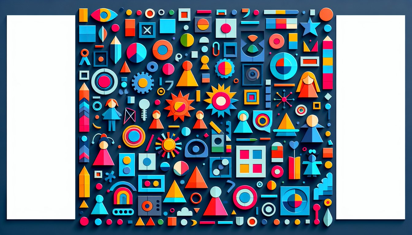
Discover how colors come to life with this free Basic Color Identification Quiz, featuring 15 fun multiple-choice questions. Perfect for students, teachers, and hobbyists who want to sharpen color recognition skills. You'll build confidence naming primary and secondary hues while exploring subtle tints and shades. Easily adapt this Color Identification Quiz in our editor to match any learning objective. Browse more quizzes and start your color adventure today!
Learning Outcomes
- Identify primary and secondary colors accurately
- Apply color-matching skills to select correct names
- Analyse subtle variations in similar hues
- Demonstrate understanding of hue, tint, and shade
- Evaluate harmonious and contrasting color combinations
Cheat Sheet
- Primary Colors in Different Models - Whether you're mixing paints or setting up a printer, knowing your primary colors is key! In traditional RYB art, grab your red, yellow, and blue; in CMY printing, it's cyan, magenta, and yellow instead. Get the scoop on why each model matters in your next masterpiece. Explore the RYB Color Model
- Formation of Secondary Colors - Mixing two primaries is like a mini science experiment that yields exciting hues - red and yellow make orange, red and blue make purple, and blue and yellow make green. This color chemistry helps you predict the perfect outcome for every blend. Watch your palette come alive with every new shade you create! See Secondary Colors in Action
- Complementary Color Pairs - Complementary colors sit opposite each other on the wheel and create maximum contrast when paired - think red and cyan or blue and yellow in the RGB world. Combining them cancels out each other's intensity, producing gray or white and a powerful visual pop. Use these pairings to make your designs jump off the page! Dive into Complementary Colors
- Hue, Tint, Shade & Tone - Hue is the pure color you start with, then add white for a tint, black for a shade, or gray for a tone. Playing with these variations lets you create depth, mood, and subtlety in every artwork. Mastering these tweaks is like having an endless box of crayons at your fingertips! Master Color Basics
- The Munsell Color System - Imagine organizing every color by its hue, value (lightness), and chroma (vibrancy) - that's the genius of the Munsell system. It's a three-dimensional map for picking, matching, and communicating colors accurately. Level up your color selection game with this powerful tool! Explore the Munsell System
- Value's Role in Depth & Emphasis - Value refers to how light or dark a color appears, and it's your secret weapon for creating depth and focus. Lighter values pop forward, while darker ones recede - perfect for guiding the viewer's eye. Tweak your values wisely to craft dynamic, layered compositions! Unpack Color Value
- Psychological Impact of Color - Colors aren't just pretty - they tap into emotions. Blue can calm you down like a quiet lake, while red might rev up your energy or signal "urgent!" Use these associations to influence mood and behavior in your designs and artworks. It's like color magic for the mind! Discover Color Psychology
- Color Harmony Principles - Harmonious color schemes - analogous, complementary, triadic, and beyond - are your recipe for aesthetic success. By choosing colors that naturally belong together, you create pleasing, balanced visuals. Experiment with different combinations to find the perfect vibe for your project! Learn Harmony Techniques
- Subtractive Color Mixing - In subtractive mixing, pigments soak up certain wavelengths of light, leaving you with deeper, richer colors. This process underpins everything from watercolor to full-scale printing presses. Understanding it lets you predict how paints blend and why your final hue might surprise you! Understand Subtractive Mixing
- Spotting Subtle Hue Variations - Training your eye to catch tiny shifts between similar colors is like unlocking a superpower for designers and artists. Regular practice - comparing swatches or using digital tools - helps you select the perfect tone every time. Soon you'll spot the difference between two "almost identical" blues in a single glance! Sharpen Your Hue Sense