UX Trivia Quiz #14 by Tom Tullis: Fonts & Typography
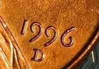
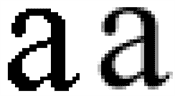
Some typefaces for figures (numerals) have ascenders and descenders, like this example from a 1996 U.S. penny. Which of the following is one of the names for this style of figures?
Old Style Figures
New Style Figures
Lining Figures
Titling Figures
This person has designed many well-known typefaces, including Mrs. Eaves, Mr. Eaves, Filosofia, and Modula. She is also a co-founder of Emigre type foundry. Who is she?
Zuzana Licko
Ilene Strizver
Marian Bantjes
Carol Twombly

What's an accidental alignment of spaces like this called in typography?
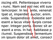
(Image adapted from Jeff Dahl - https://commons.wikimedia.org/w/index.php?curid=3739407)
River
Ligature
Valley
Spaceship
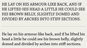
In a 2011 study, participants were asked to read and remember 21 pieces of information presented in one of three different text treatments, shown below. Fifteen minutes later their memory was tested. Which treatment resulted in the lowest recall?
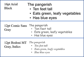
16pt Arial Black
12pt Comic Sans Gray
12pt Bodoni MT Gray Italics
There was no difference
Who wrote this classic book on the Legibility of Print, first published in 1963? This person conducted research on the effects of typography on reading for over 30 years.

Miles Tinker
George Sperling
Elizabeth Loftus
Carolyn Sherif
When reading, the eye jumps from one fixation to the next, as shown in this gaze plot from an eye-tracking study. What are these "jumps" called?
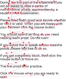
Image from Alcock, Hodds, Roy, & Inglis (2015) Investigating and improving undergraduate proof comprehension, Notices of the American Mathematical Society, 62(07).
Saccades
AOIs
They're just called Jumps
Boinks
What's it called when you add shades of gray or colors to edges of letters to make them appear smoother, as in this example on the right?
Anti-aliasing
Cheating
Blurring
Propagating
{"name":"UX Trivia Quiz #14 by Tom Tullis: Fonts & Typography", "url":"https://www.quiz-maker.com/QMAAJOV","txt":"Ten questions dealing with the history of UX!","img":"https://cdn.poll-maker.com/28-1011209/quiz-14.jpg?sz=1200"}
